Overview
Georgia Tech's meal plan serves over 19,000 users, including all first-year students and faculty members. To enhance user experience, we developed a mobile app for easier and faster meal plan management.
As the UX Designer, I managed the end-to-end design process, focusing on onboarding, illustration, UI design, and creating a style guide for design consistency across the team.
The app is scheduled to launch in 2025, aiming to significantly improve user satisfaction and streamline the meal plan management process.
Timeline
May 2023- Jul 2023, 2 months
My Role
UX Designer — Cross-functional team collaboration, User Research, Interaction Design, Visual Design, Prototyping, User Testing
Product Focus
User-Centric Design, Mobile Design, Digital solutions for campus services.
Team
4 UX Designers
Problem Space
The current design is unclear and overwhelming with information
The current website is overloaded with information and has a cluttered visual design, making it hard for users to find what they need. Additionally, accessing support requires navigating to a separate site to submit a ticket, with uncertainty about response times, adding to the usability challenges users face.
Competitive Analysis
I want to know if other schools have an app to manage their meal plans
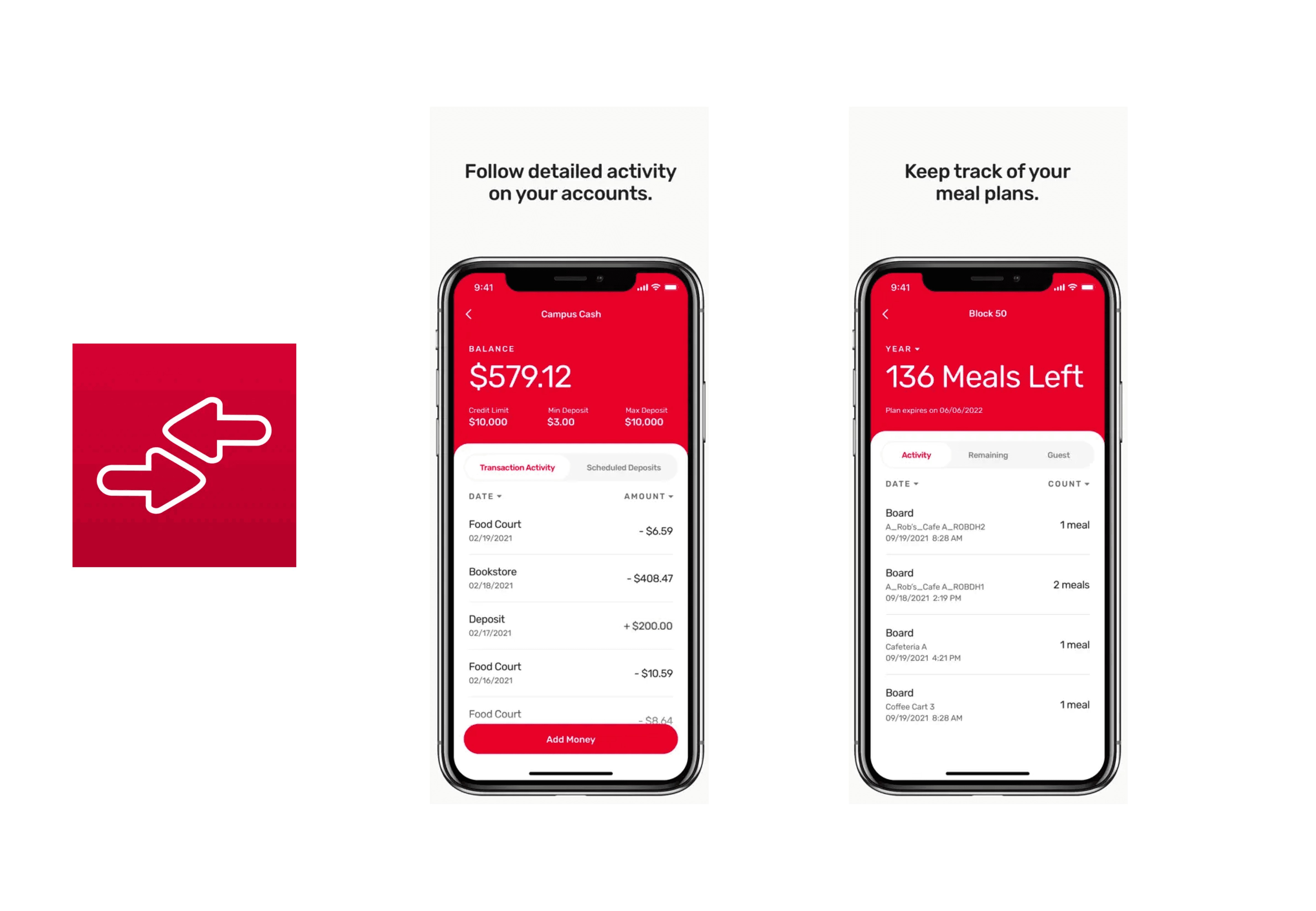
In my research, I found that no schools currently have a dedicated app for managing meal plans, relying instead on third-party apps. I evaluated these apps' strengths and weaknesses through user reviews, focusing on features like transaction history, meal swipe overviews, and management dashboards. This analysis guided our approach to enhancing the user experience in our application.
Design Decisions
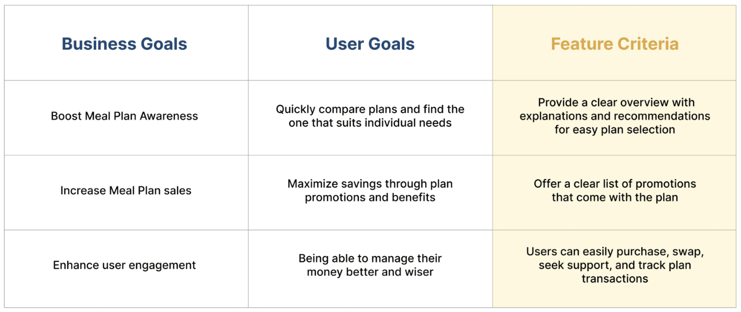
I aligned business goals with user goals to shape product features
After a competitive analysis of other products, I identified the essential feature requirements to include and consider for our product.
Design Process
Information architecture to organize the content
The team gathered, broke down the information for the app, created the IA to visualize the relationships between them, and organized it.
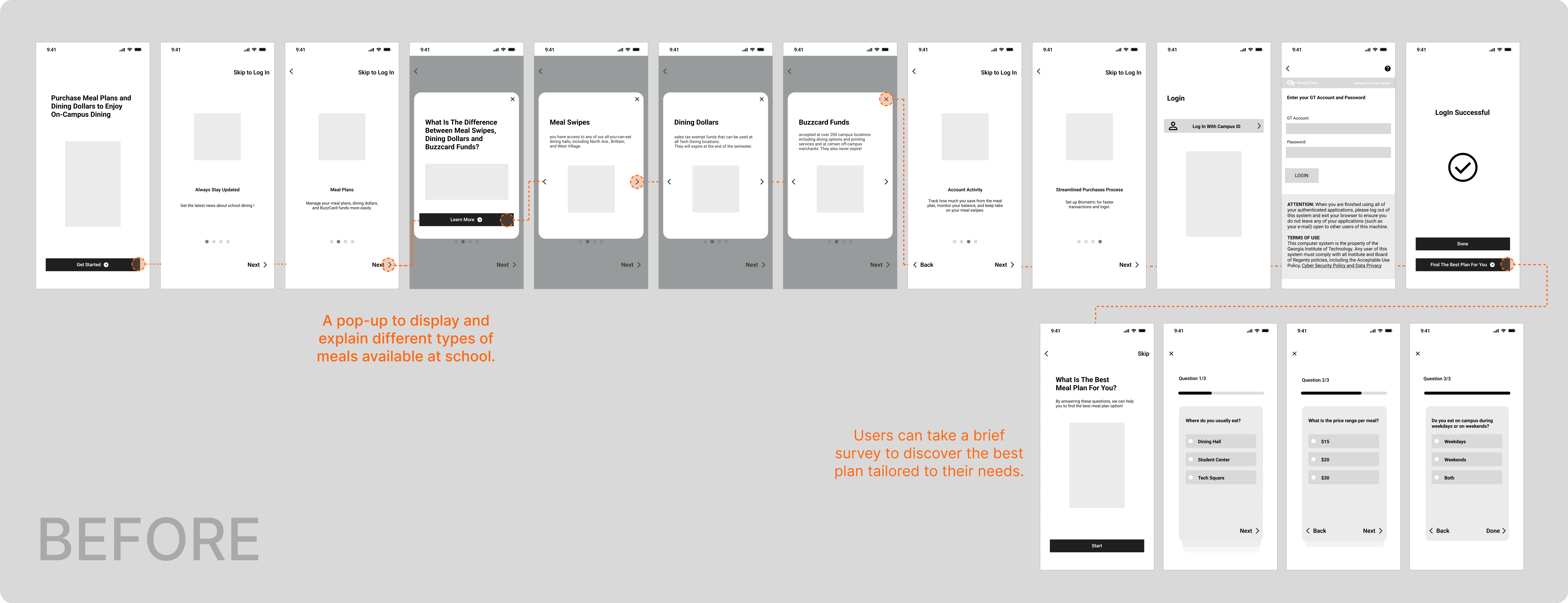
Put our ideas together and visualize the flow through lo-fi prototypes
Testing & Iteration
Identify usability issues and gather insights for refining the design
I conducted more than 5 usability tests to gather feedback from our users about the flow and how the design could be improved.
Feedback - "The onboarding is too long; I just want to quickly get into the app and see how it looks."
Feedback - "I like the recommendation option for choosing a plan, but I also want to see the benefits I'll get."
Final Design
Simplify Your Life with TechEats
01- Learn about TechEats and its main features
Onboarding provides a quick overview of what users can do in the app and how it helps them easily manage their plan.
02- Never miss a promotion and stay on track with your dining money
Receive the latest news and promotions for the meal plan to help users save money and stay on track with their spending.
03- Get to know various plans, benefits, and recommendations on plans that suit your needs
Users can view popular meal plan options for most people, along with detailed explanations of each plan. Importantly, the benefits are highlighted to help them choose the best plan for saving money.
04- Find support, help, and easily edit plans
In TechEats, you can easily find support from the school meal plan team and solutions from the community in the Q&A section. Additionally, TechEats allows users to easily swap plans on their own.
Style Guide
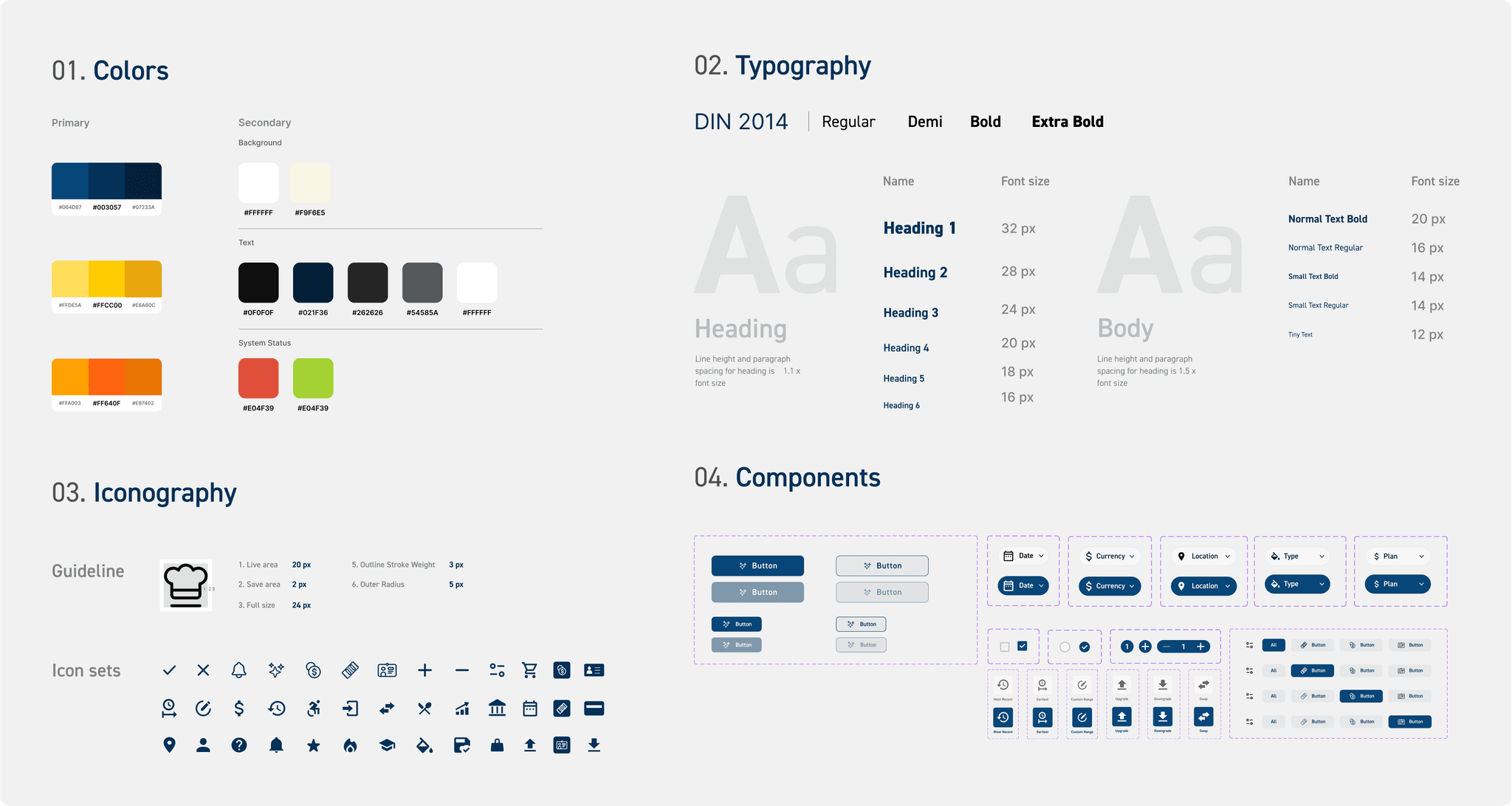
I created the design system for the team to follow and keep design consistency

Retrospective
Result
Takeaway
Next Steps


